Today I learned that all German nouns are capitalized whether a person, place or thing. I looked this up because I was already familiar with the term “leitmotif” having studied music as my undergraduate major. It is a recurring musical element that I remember learning about when studying opera composers. Certain phrases or even instrumentation would be associated with a particular character. A modern day equivalent might be the Imperial March from the Star Wars movie franchise always signaling something related to the Dark Side or Siths. Or if you have watched any of the Game of Thrones series, you can often hear the same musical phrases when drawing attention to Stark characters from Winterfell or Lannisters from Casterly Rock (one of the most disturbing moments is at a certain wedding reception!).
One of the opening quotes from Chapter 3 references a “Leitmotiv” (capitalized because of the use of the German spelling):
In photography, the smallest thing
can be a great subject. The little,
human detail can become a Leitmotiv.
— HENRI CARTIER-BRESSON
It’s likely coincidental, but the Wikipedia entry about leitmotifs references Wagner’s Der Ring des Nibelungen as an example of opera’s featuring leitmotifs. There is a connection between Andvari (mentioned at the very end of the book) and a character named Alberich (the person who made the ring) in this opera. You take a listen here:
I am thinking about different types of ways that the author might weave recurring themes or elements into Part 1 of the book especially. I would certainly not be the first to comment on recurring ideas such as joy, music, thread(s), and transformation. These might be considered thematic leitmotifs.
Another type of theme might be connections to ancient culture, whether its Greek, Roman, Egyptian, Colombian, Vietnamese, Cambodian, or Native American.
Use of color might be a theme. Early on I wondered it each box might have a color associated with it and possibly inform what treasures might be inside. My thinking was something like this:
Appalachian Footpath Box - blue & purple (because of the color on the box )
Forrest Fenn Box - gold/yellow (because of the mostly gold items in Fenn’s treasure)
Past & Future Box - grayscale - clear to silver to gray to black (because of the moon)
Pokemon Box - red & green (because of the two Pokemon game versions mentioned)
Lion’s Share - all colors (because of its design featuring elements of each of the smaller boxes).
I have no evidence to support this thinking - I was just trying to make a construct to work backwards from and see if anything was there (I didn’t see anything, but maybe someone else will!)
Because the quote references photograph, detail, and Leitmotiv in the same sentence, I wonder if there is some important connection to the use of various frames of images. I know folks have traced many of the borders to various stock image providers, but that does not mean there is not some meta-purpose to where such borders are used.
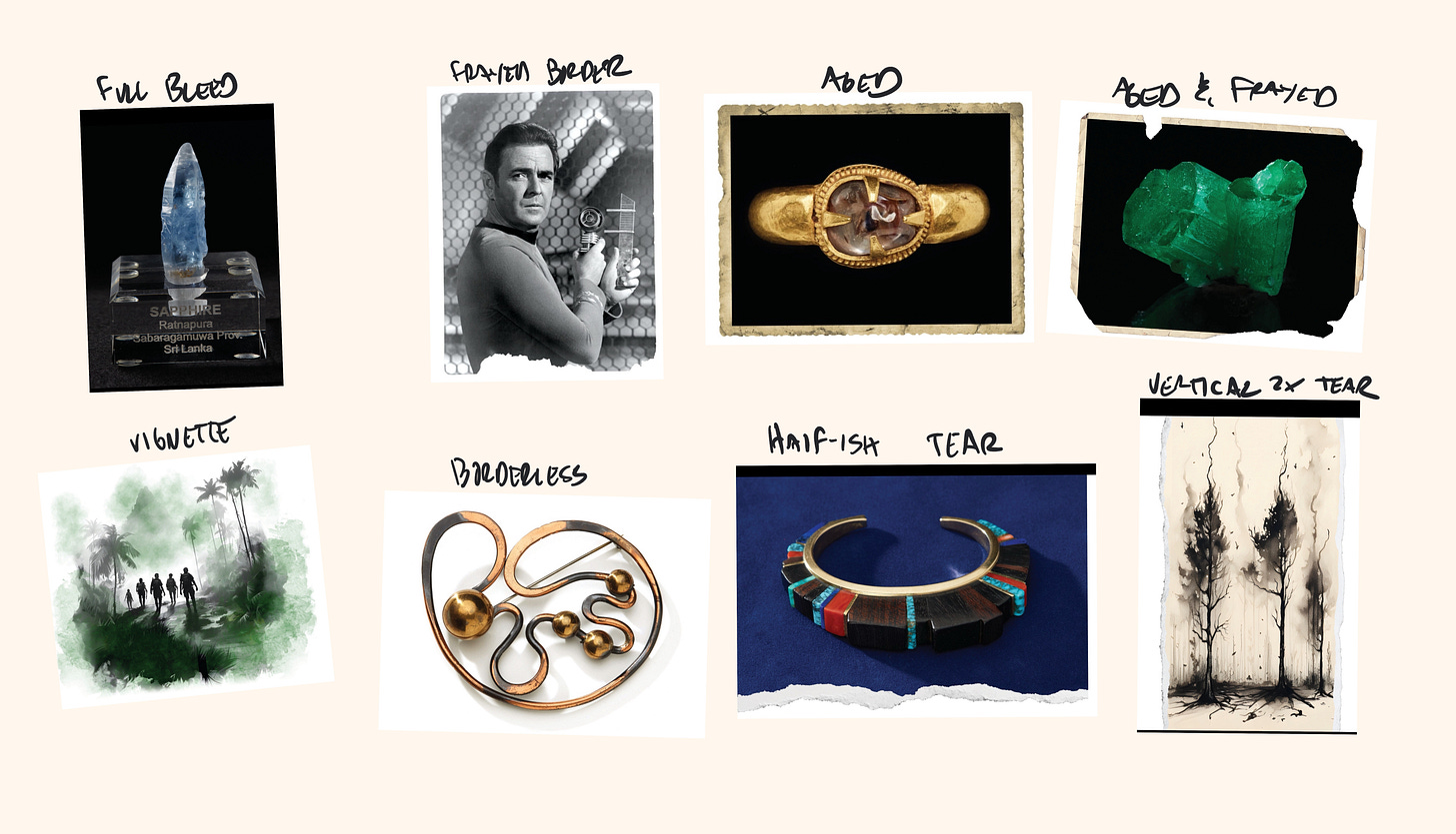
Below are the different photograph and illustration treatments I see in the book with examples of where they appear. I am not considering page backgrounds or layout dividers here for now - I still believe they have potential to be part of some kind of leitmotif).
Full bleed (the Ch1 sapphire opening opening image, photo of Wilma Rudolph)
Torn-frayed border (the Scotty photo, the double lotus ring)
Aged photo border (eKhmer gold ring, 3rd Faberge Imperial Egg)
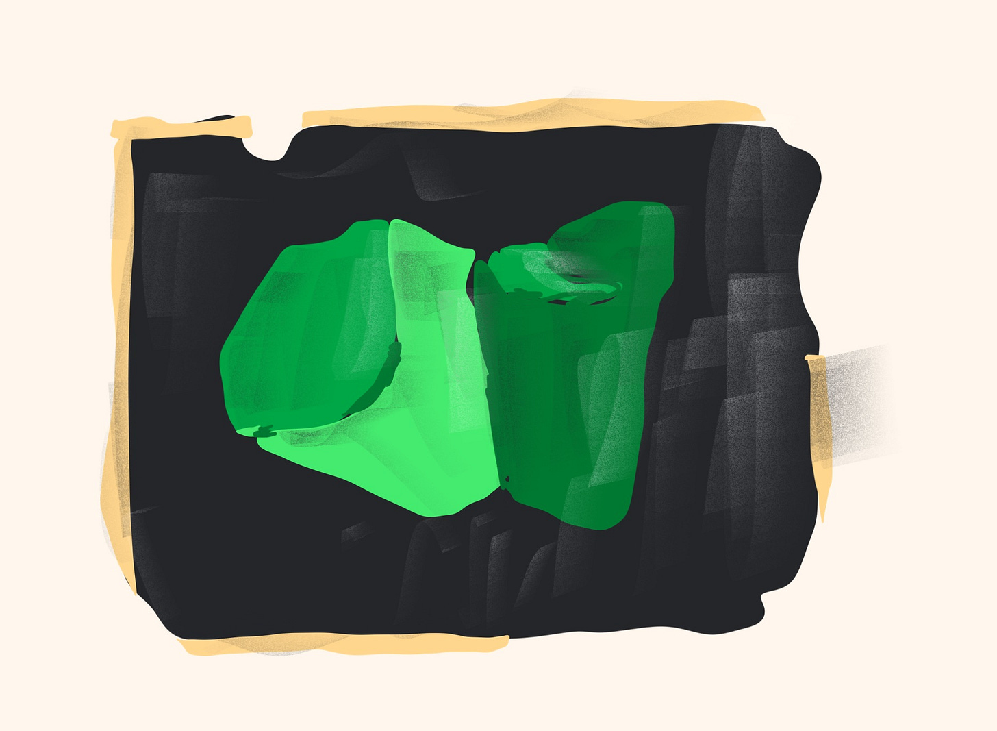
Aged and frayed (the Chivor emerald, ruby ring)
Borderless (Ch. 3 Lion’s Share box & Faberge magnifying glass)
Vignette (the jungle hikers illustration, airplane illustration)
Full width half-or-more page tear (“Angkor Wat”, Loloma bracelet)
Vertical double page tear (forest fire, boy looking at stars)
I’m not yet motivated enough to chart the image treatments out by frequency, chapter location, page numbers, etc. (maybe someone else wants to). But I did start some new trains of thought:
Page 147 has kind of a collage that I am sure was made digitally. There is a borderless medal over a aged border team photo over an aged and frayed image of the edge of the medal.
The forest fire and boy staring into the stars images easily could have been laid out as full bleed illustrations or vignettes. I actually find this border to be somewhat unattractive (so I think it’s an intentional element).
I have not paid enough attention to either of these images - I am noticing a bunch of potential details (arrows, letters, X’s, repeated patterns) that I had not before - like this down arrow and letter M/W:
A counter-argument: if the author did try to use the image borders to conceal clues, this would only be successful if he did the book layouts and image border selection on his own. If he were sitting side by side with someone with a creative eye they may have advised certain borders etc. be used a certain way and then he might have had to say “it has to be this way” which could give that editor some advantage. On the other hand, he could have just given his style preference for all of the photos (some with clues, some without) and just said please do it all exactly this way and make it look decent.


